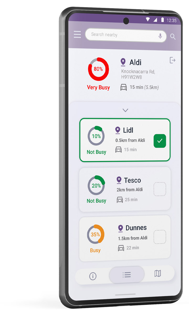
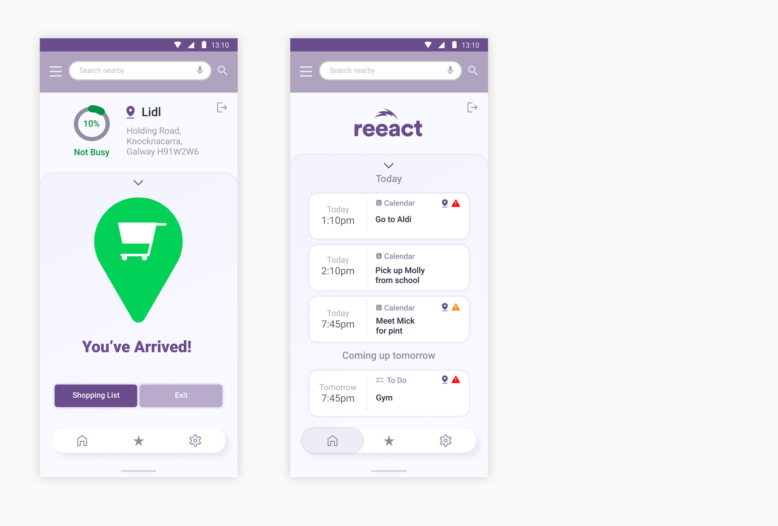
Reeact is a conceptual intelligent interactive time saving mobile and watch app to help us navigate through our busy lives.
Project
Reeact App
Year
2022
Tools
UXD
Research
Wireframing
AI Integration
Watch
Prototyping
Platform
Mobile
Watch
The Project Outline
The app is a conceptual productivity-based time-saving app fully integrated with the end-users calendar, to-do list, shopping list and daily planned activities. It’s goal is to save the user time by reporting busy times in all locations related to the users day and identify potential time-based issues and pressure points and offer warnings and help to the end-user by initiating suggestions and alternative actions.
Key Tools
⸺ Research
Research for this project involved looking at what could enhance a busy end users life and learning what the end users of a system or product like this need and want.
⸺ User Persona
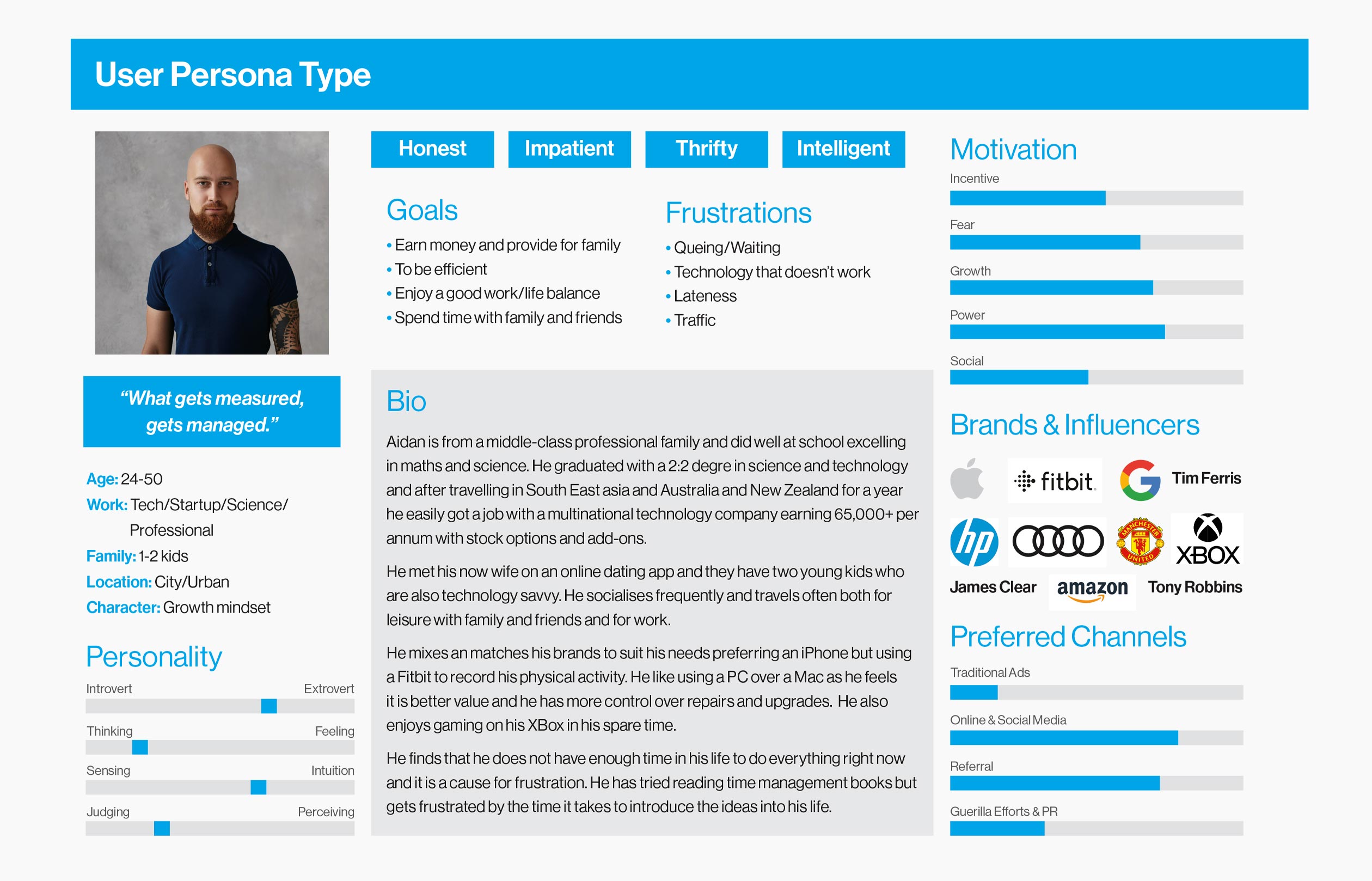
Building on the research phase I developed a useful User Persona on which to base the needs, wants and ultimate direction of this conceptual project.
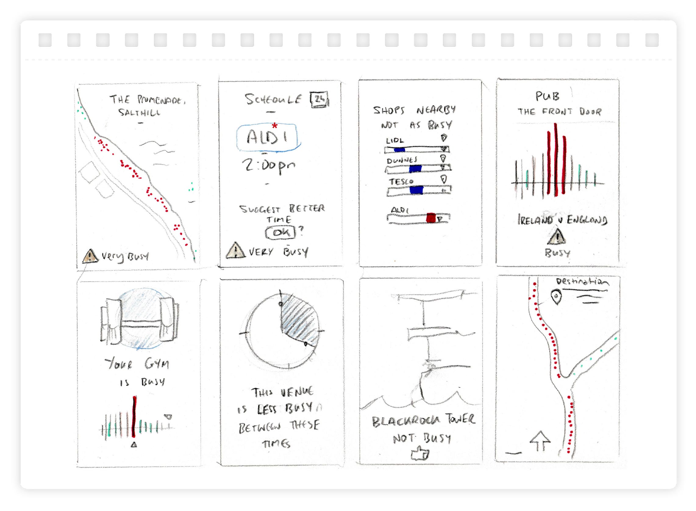
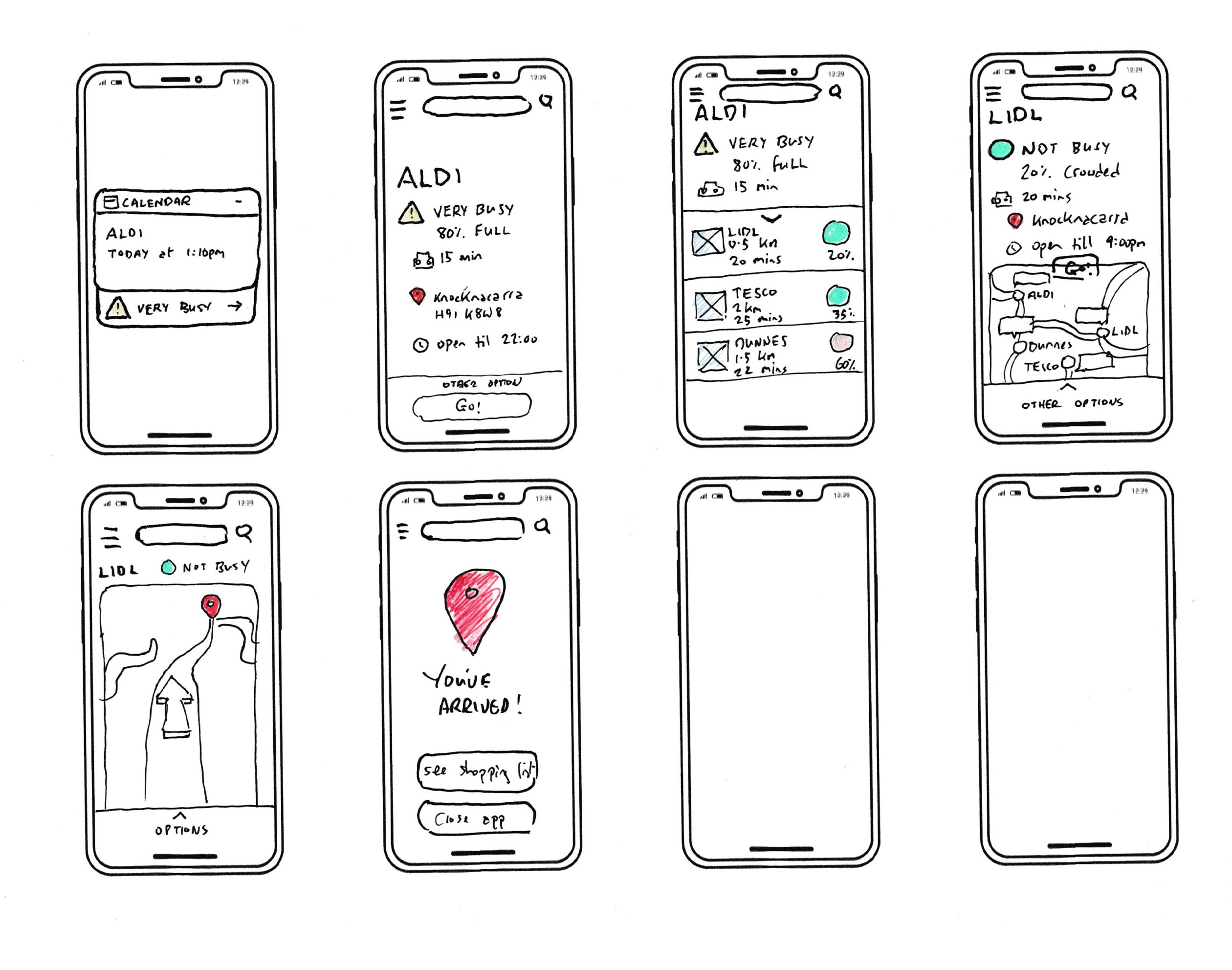
⸺ Crazy 8's
Crazy 8's was a fast-paced, generative exercise to help get me thinking broadly about the problem I was trying to solve. This free flowing and thinking method suited my previous experience.
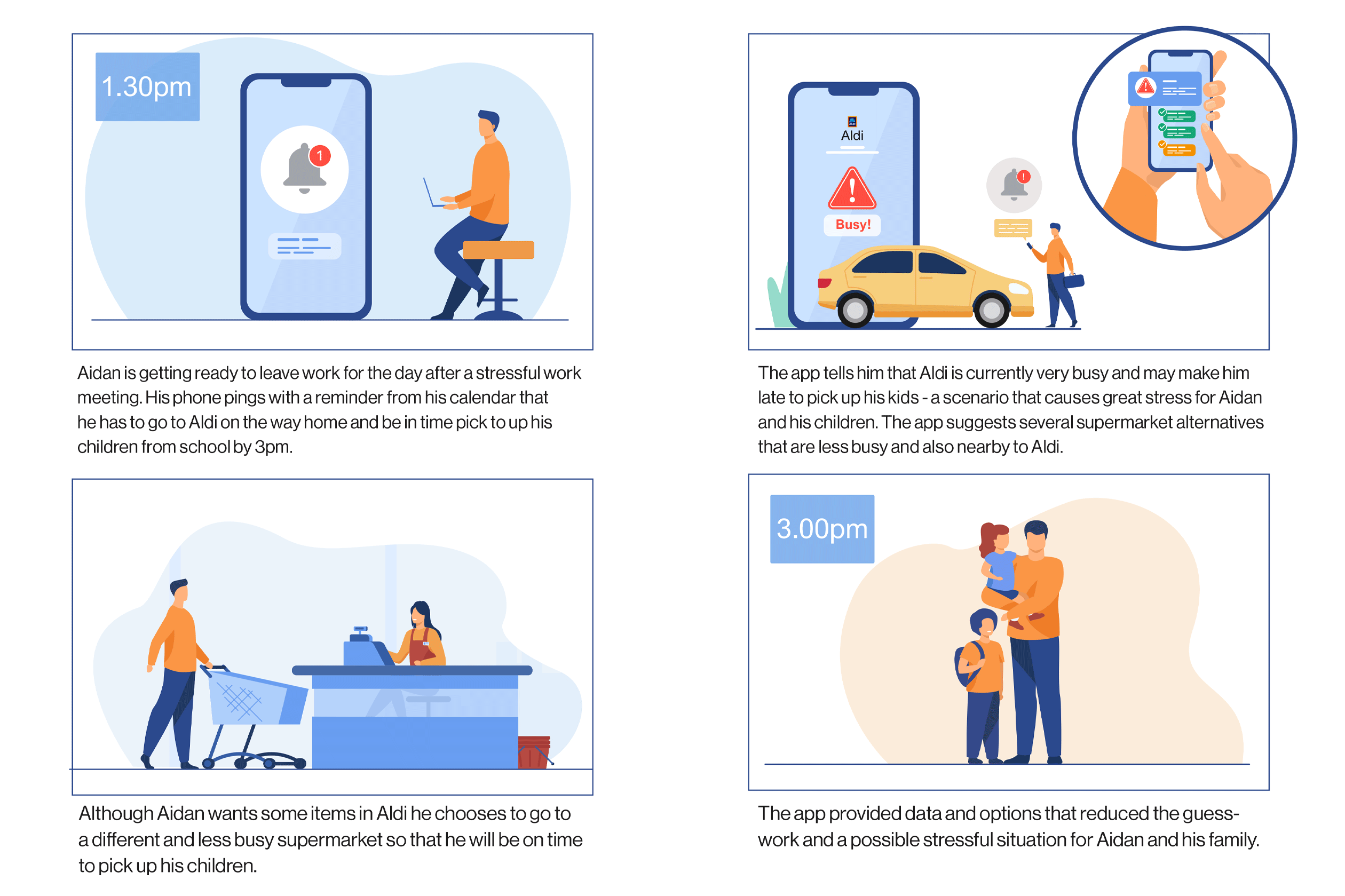
⸺ User Scenario
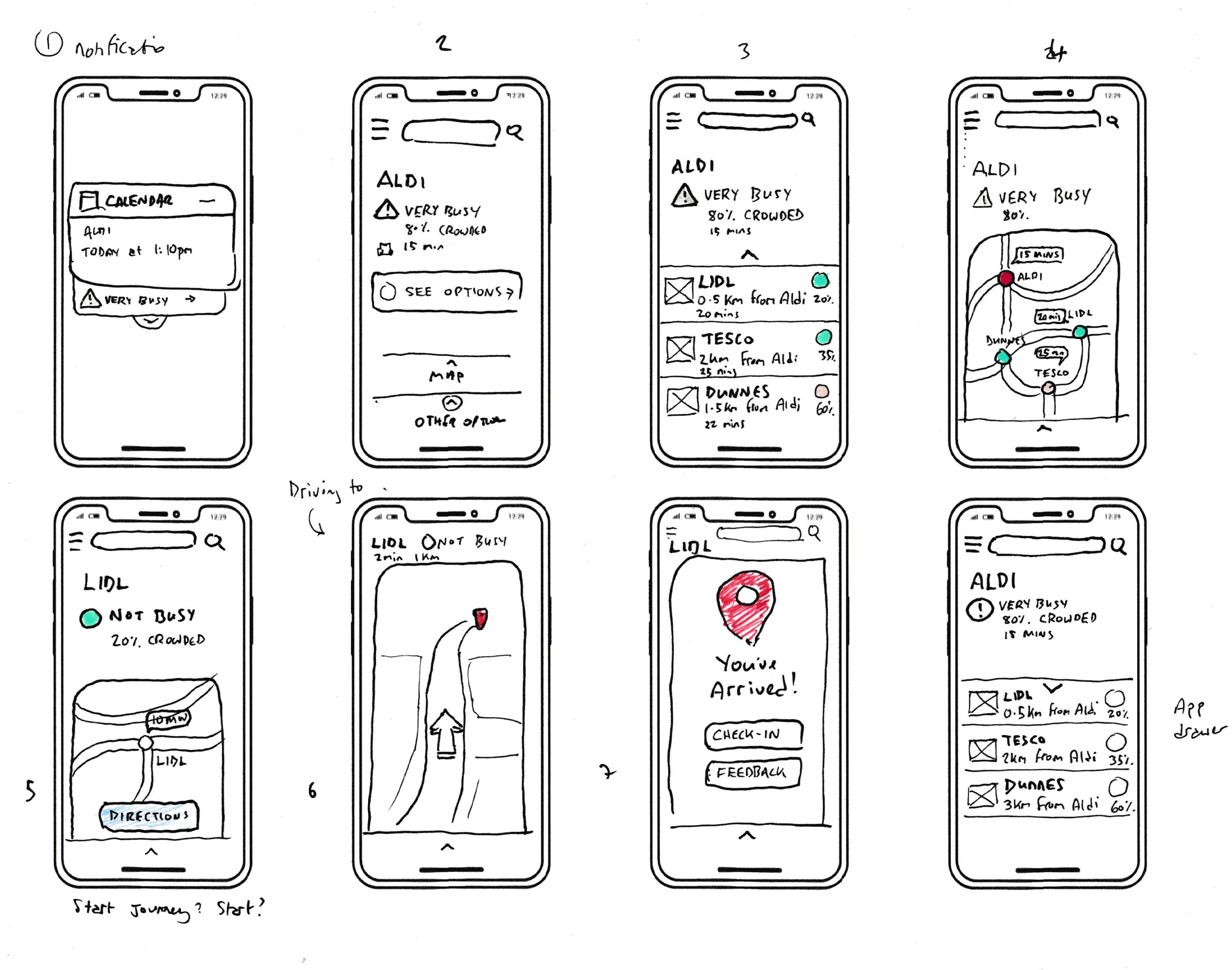
My User Scenario was a detailed descriptions of my user in a realistic situation relevant to the design of a solution and helped me to understand the practical needs my users.
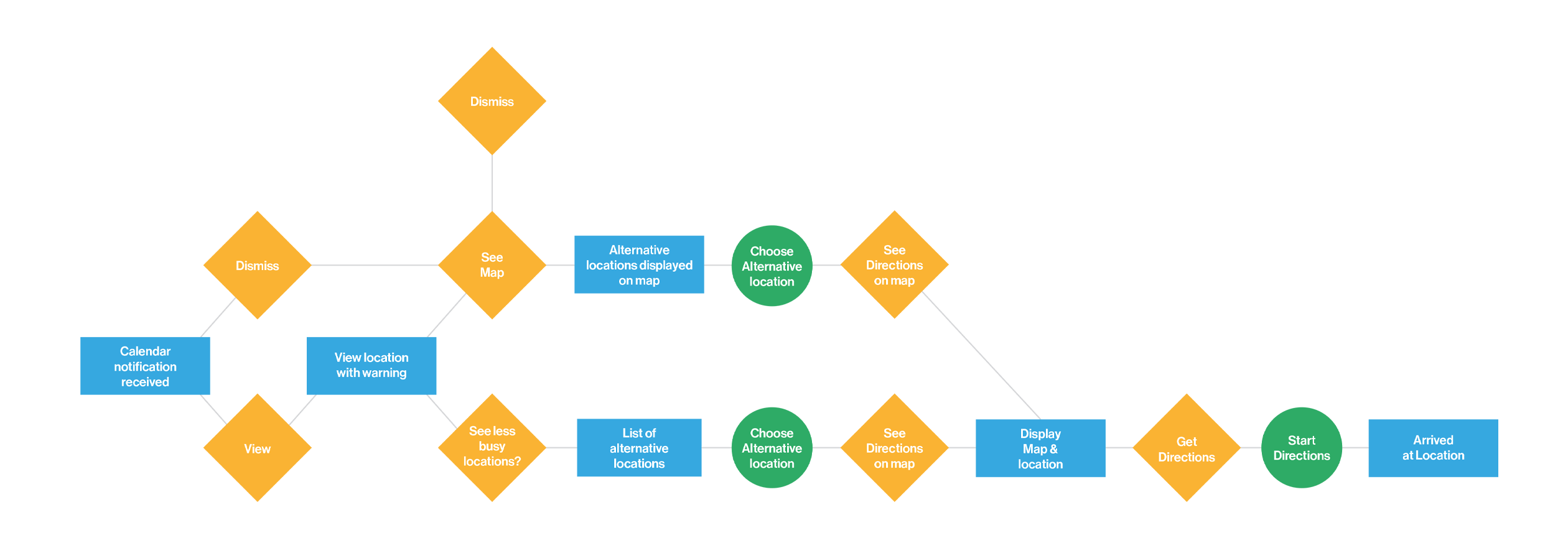
⸺ User Flow
My User Flow was generated from the User Scenario and helped firm up the path taken by my prototypical user on the app in a particular time-squeezed scenario.
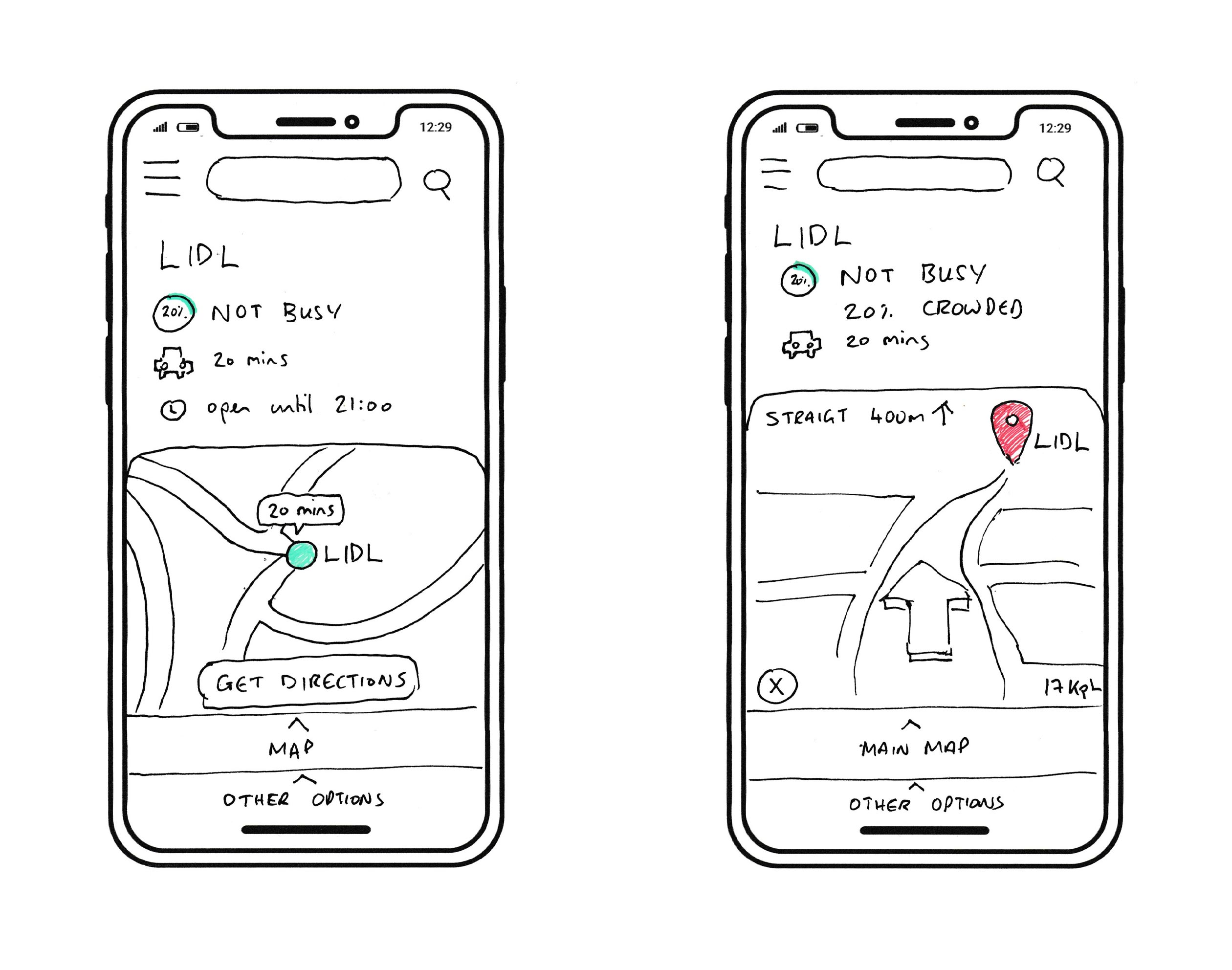
⸺ Paper Prototyping
My skillset was ideal for creating a Paper Prototype as part of the process. The paper representations of the product helped me further realise the projects conceptual and test design.
⸺ User Testing
Basic User testing was carried out with the paper prototypes to quickly identify any glaring flaws in the project up to that point and uncovered several recommendations.
⸺ Figma Prototyping
The final step of the project was the creation of high fidelity functioning Figma prototypes for both the app and wearable user flows based on the previous steps.
Identifying a problem
The problem I identified is one of time and efficiency with the secondary issue of covid and disease control. In this world of the quantified life and hyper-efficiency time is becoming ever more valuable. Standing in queues, sitting in traffic, frequenting busy places with no space, parking or too many people is becoming less attractive to the average busy suburban person.
57% of the planet live in an urban setting worldwide.
I evolved a simple user/need statement to start the discovery and conceptual process:
The user needs to quickly ascertain how busy a location is in order to save time and live a more time-efficient day and reduce stress as lack of time is a problem for them.
Research
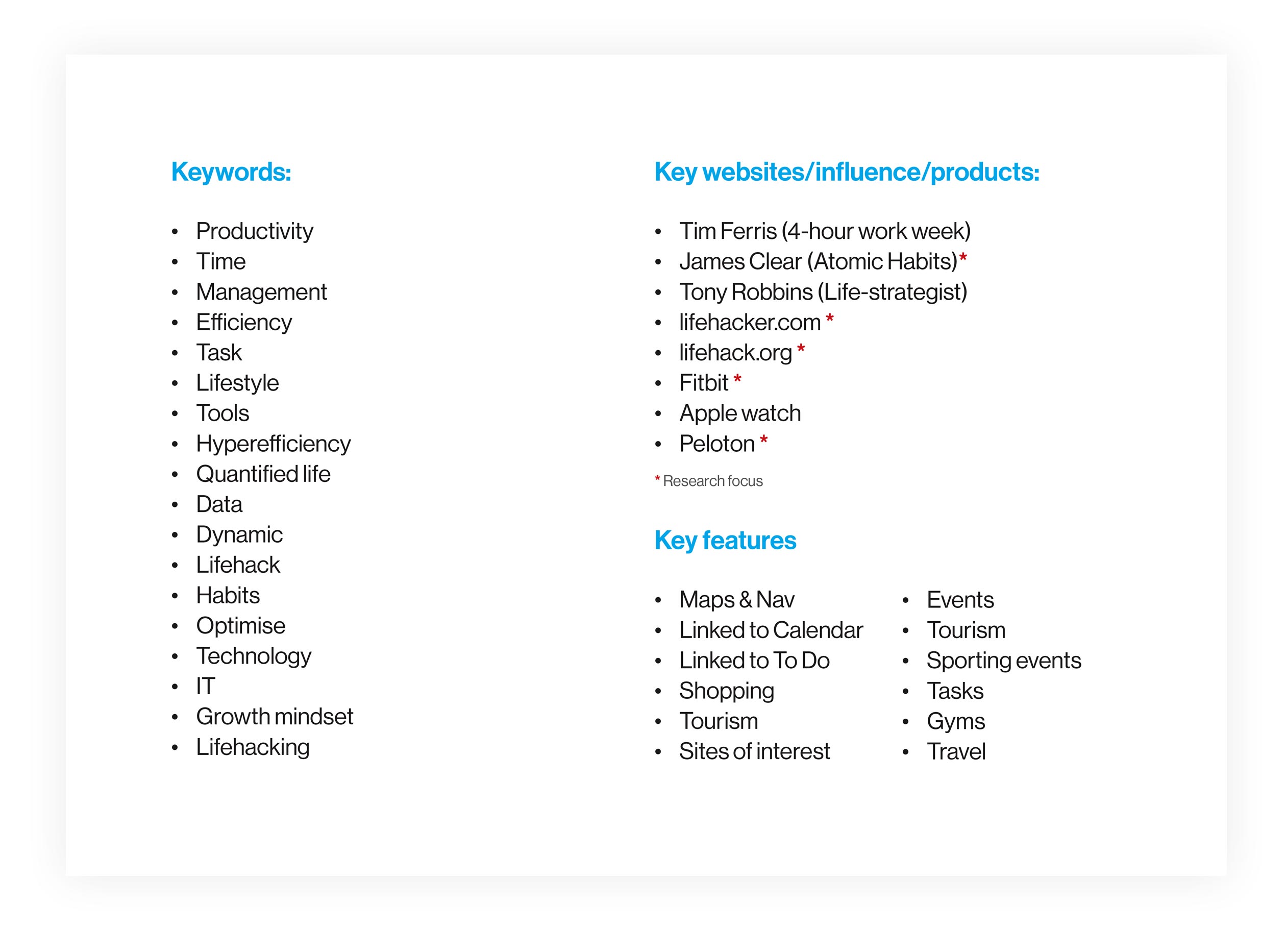
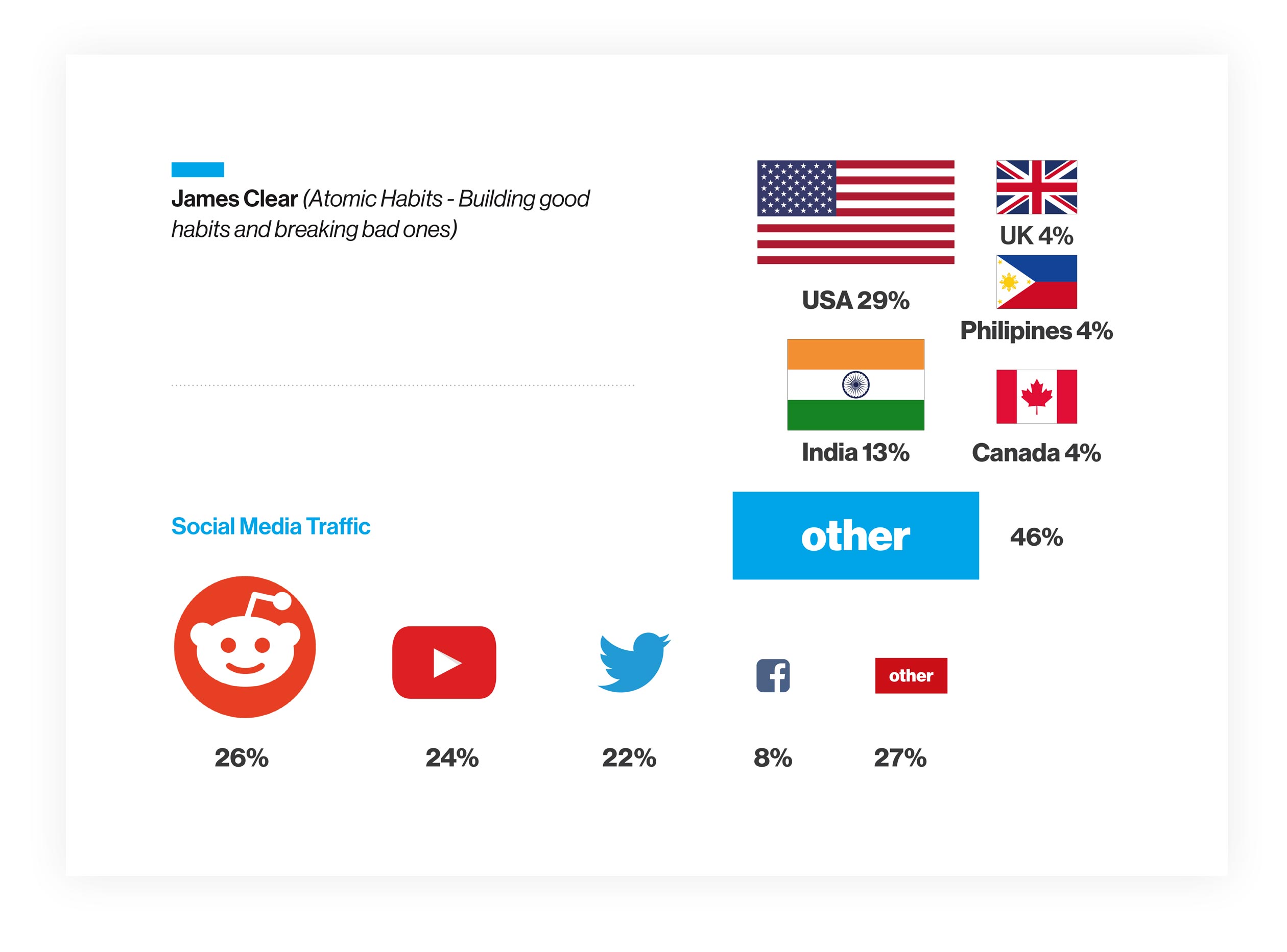
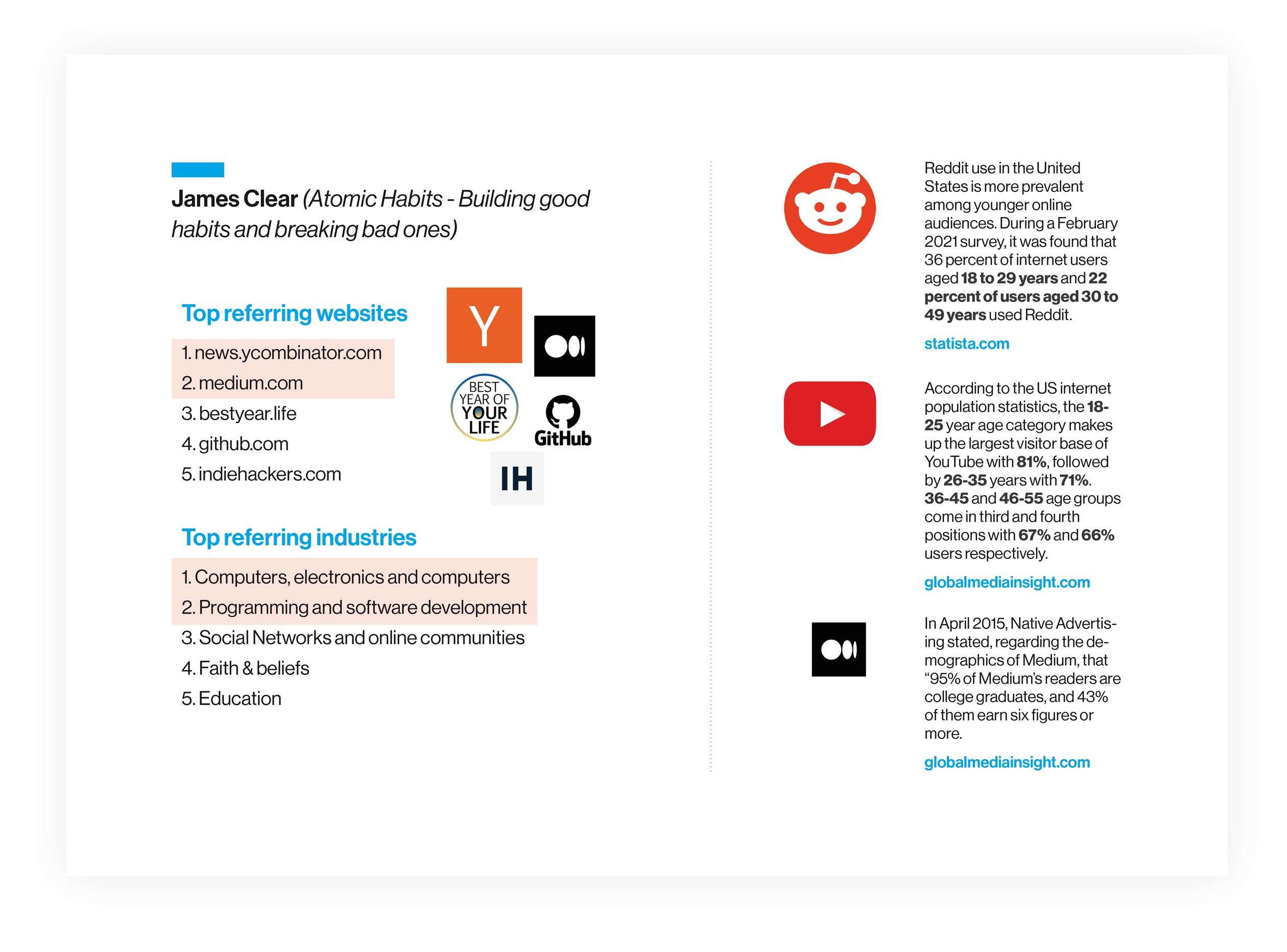
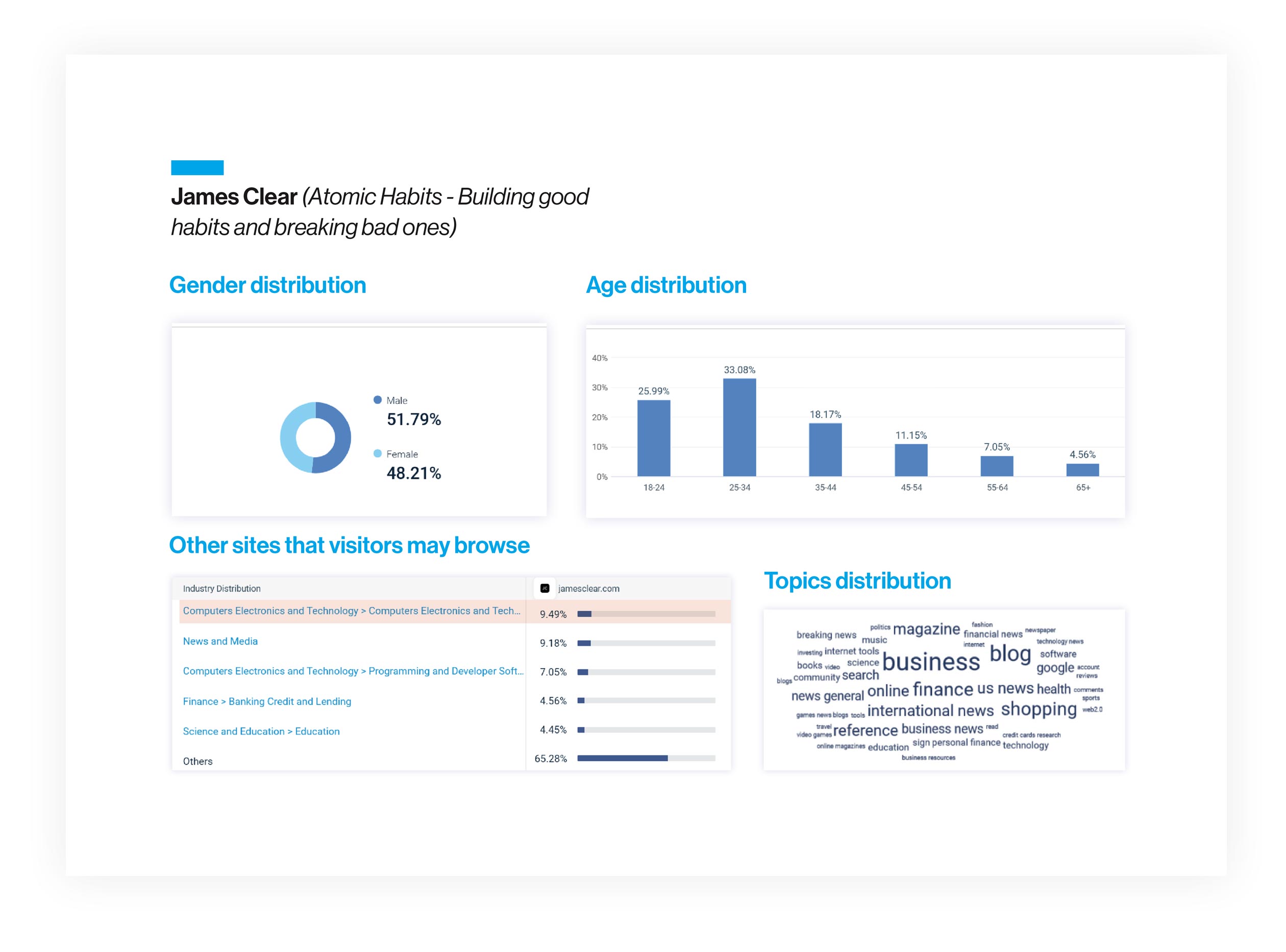
Through thorough research into the potential productivity, lifehack and quantified-world sector – thinking along the lines of a James Clear reader crossed with a Tim Ferris fan. I developed a user persona who I felt would represent a good candidate group to begin work on the apps conceptual development. The initial user group I was targeting are well paid, professional, interested in alternative ways o doing things and above all time poor.
User Persona
Creating the user journey
Crazy 8’s proved a useful tool in quickly brainstorm a scenario to build on to help fix a good use-point for the fledgling app concept. This free thinking and drawing tool suited my background and way of thinking and seeing things.
Crazy 8's
4-Up User Scenario
User Flow
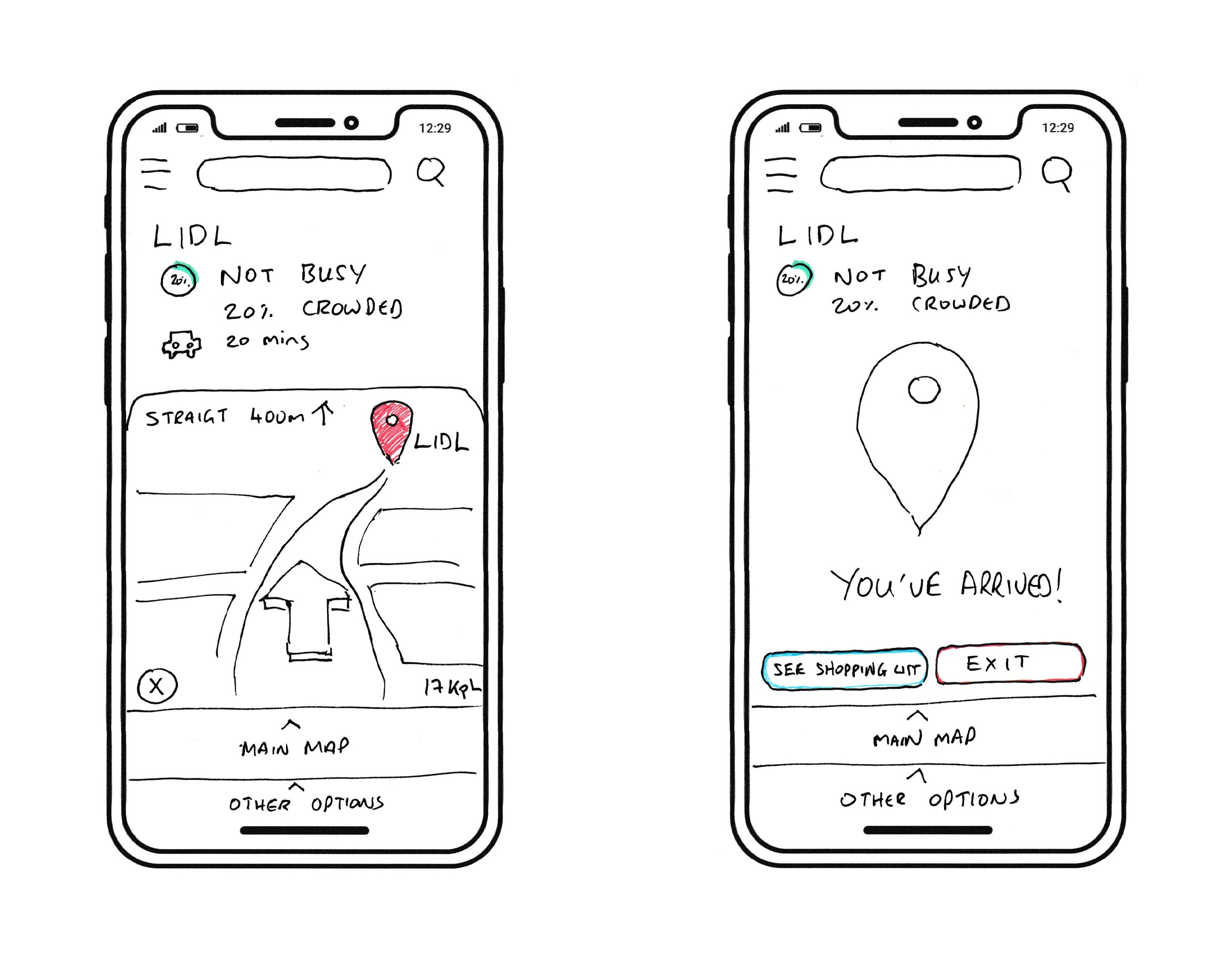
Paper Prototypes
User Testing Overview
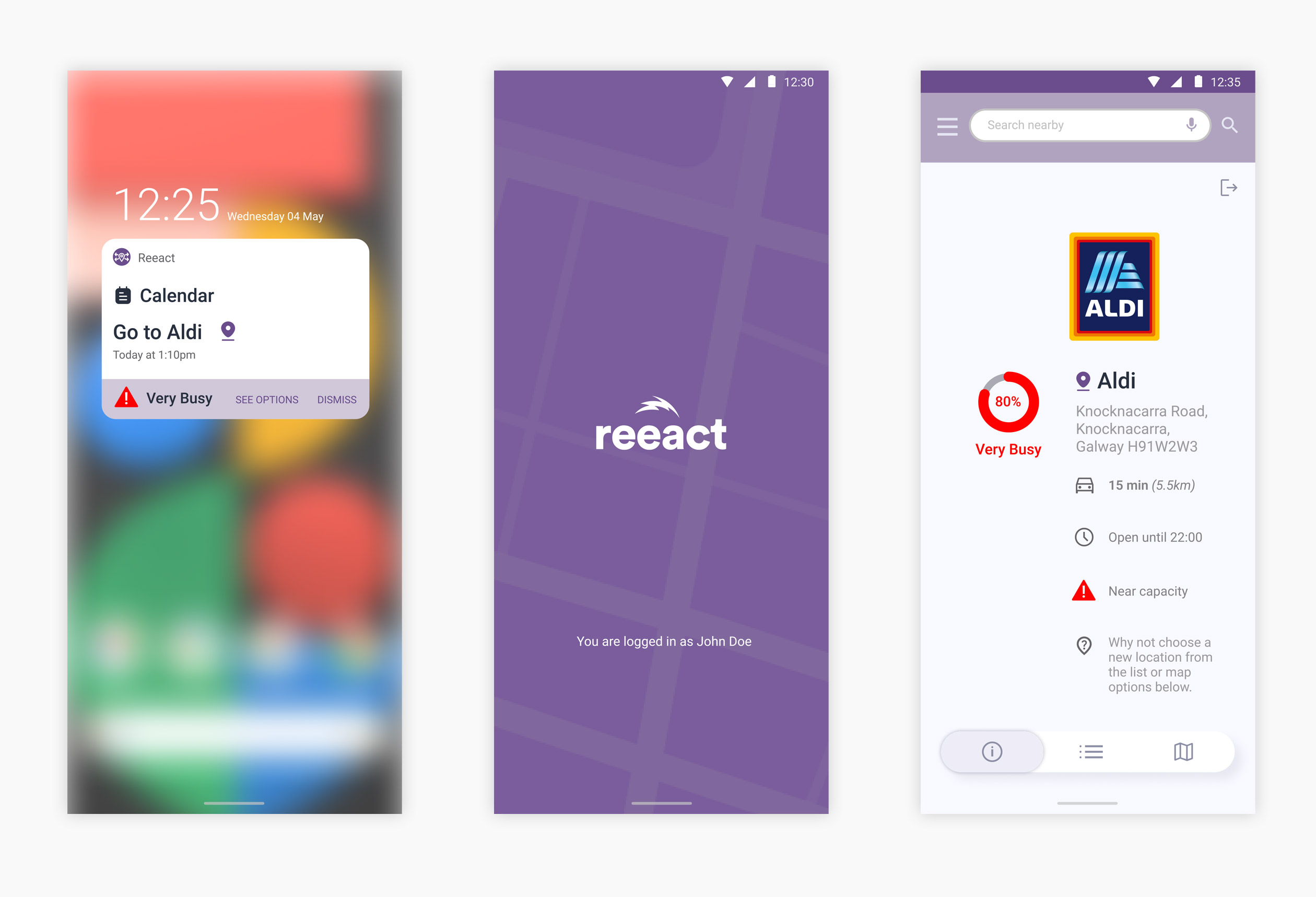
The tester was tasked with navigating through the screens on the app to perform a simple task triggered when the app has identified that a supermarket that the end-user was scheduled to use ‘Very Busy’ and may cause an issue with other calendar tasks.
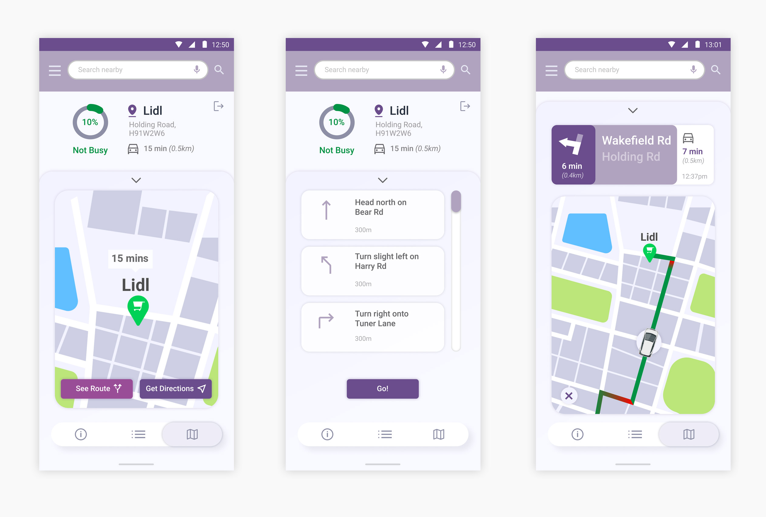
The primary purpose of the usability test was to observe the user navigating through screens that would take the end-user to a less busy supermarket.
This usability test report describes findings and recommendations from the test.
User Testing Findings
- The test participant easily comprehended that the app was indicating an issue with a calendar task and once inside the app found it easy to perform the simple task outlined
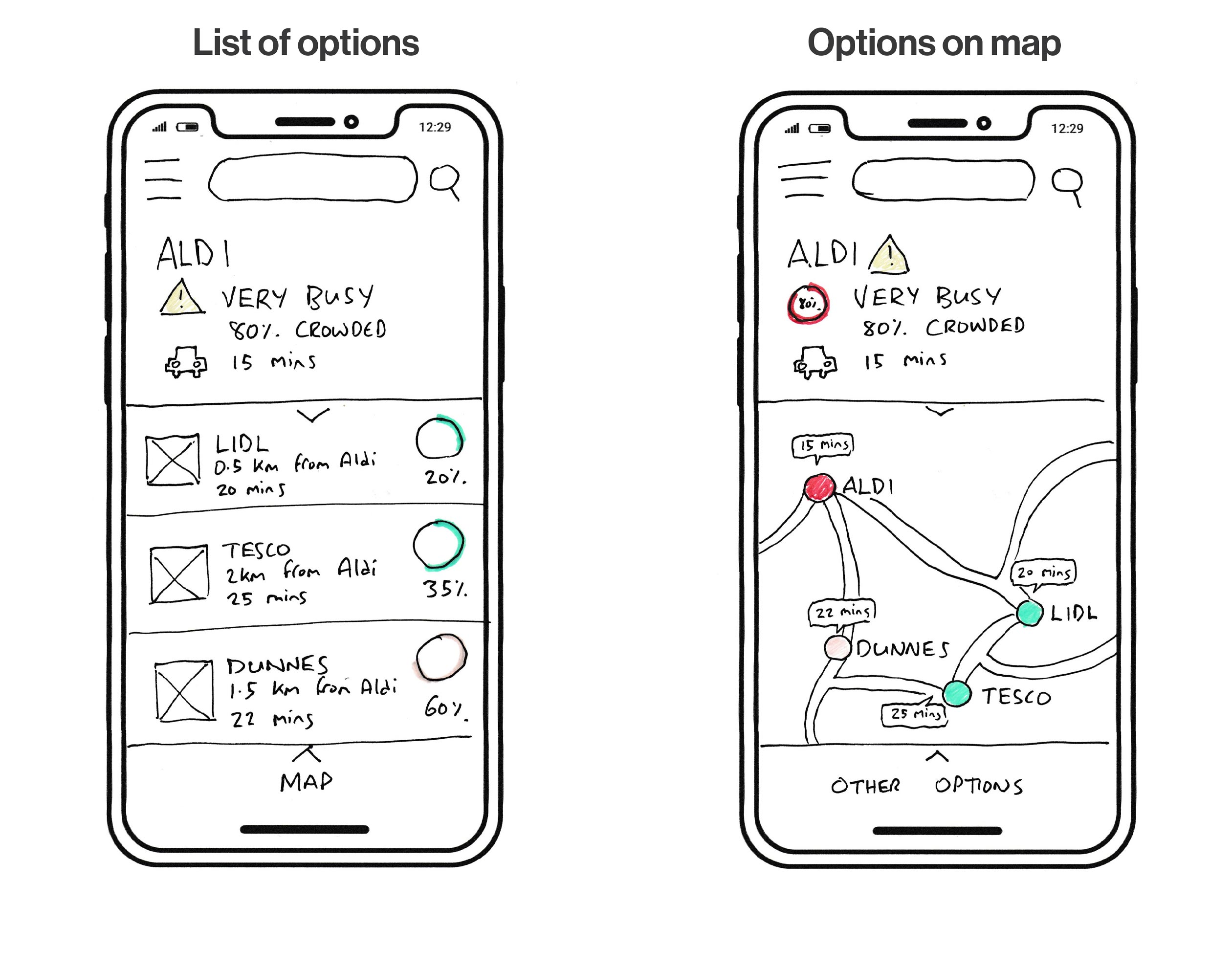
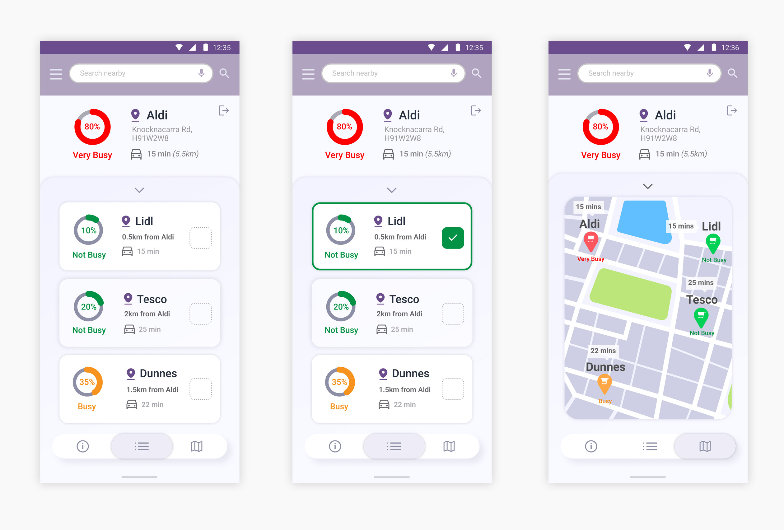
- The user intuitively clicked through the two options presented to help the end user identify a less busy location.
- The test participant clicked both the list based option and the map indicating other less busy supermarkets.
Potential Problems
- The user was initially unsure where the ‘Map’ option would lead.
- The initial notification must use clear language to outline the issue it is trying to help with.
- The app must only identify issues significant to the end-user.
Changes to be introduce from test findings:
- Other transport options need to be taken into consideration although the plan is for the app to be sensitive to the end-users usual mode of transport
- A reschedule task option made available if all locations nearby and convenient are busy
Suggested enhancements
- The initial notification needs visual and linguistic refining to indicate to the end user the significance of the issue
- The app needs to be identified by a logomark and name moving forward to help identify any app-based interaction outside of the main app screen
- The ‘Map’ and ‘Options’ buttons need refining and possibly better labelling to help better indicate what will happen when pressed.
- A few new simple features were identified to possibly include in the app like rescheduling, other transport options and potential to offer online shopping linked to an external app.
Prototyping
A high resolution working prototype was made with Figma to further test the concept. The prototype was based on the work dome on the paper prototypes and the user research carried out on them.
Figma Prototype
Watch app
The second phase of the conceptual project was to create an AI powered watch app that would compliment and enhance the user experience.The watch app would also use speculative technology to generate haptic feedback for a proximity feature.
I used the following statement as a basis for it’s conceptual development:
The user has 30 minutes to complete his shopping list before having to leave to pick up his daughter from school. This can be stressful and stress, time wasting and queuing is what the user is trying to avoid. There’s an opportunity to make his trip to the supermarket easier, more pleasant and more efficient.
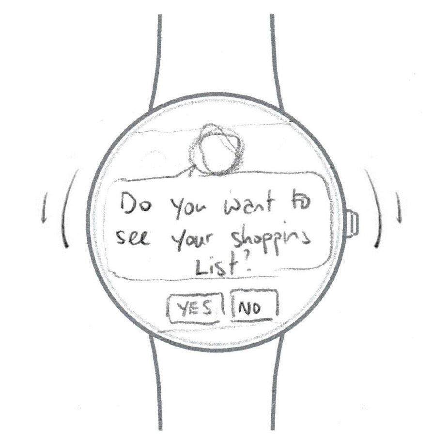
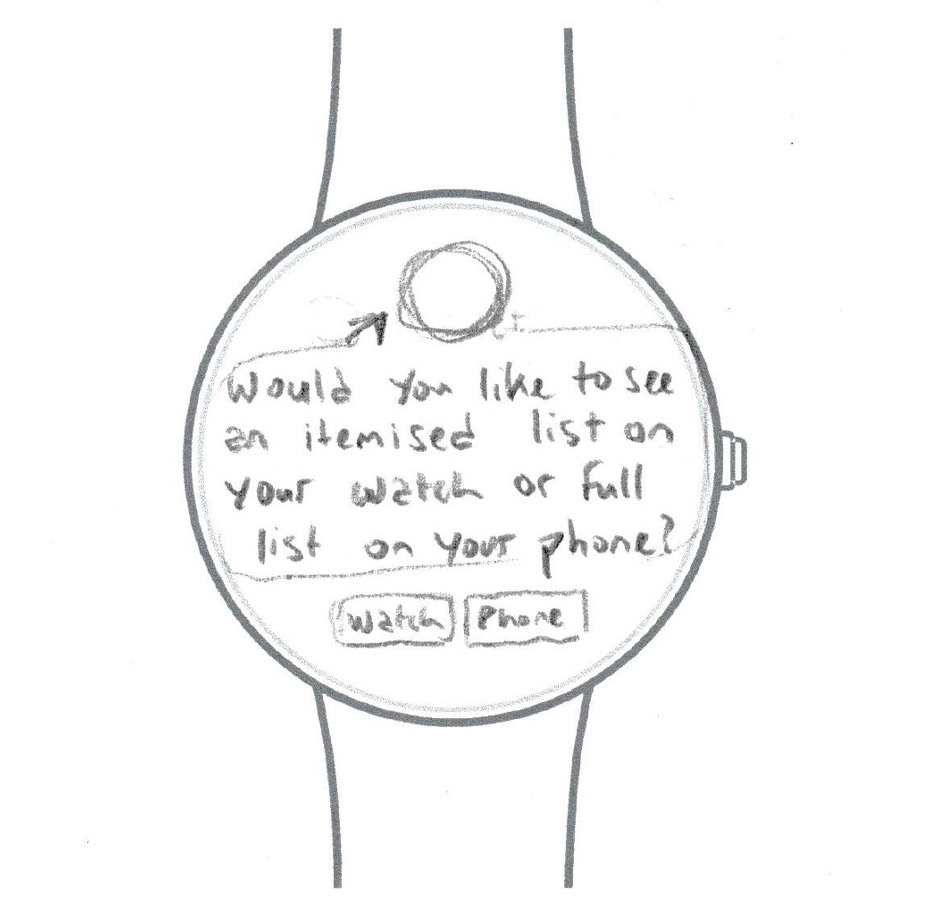
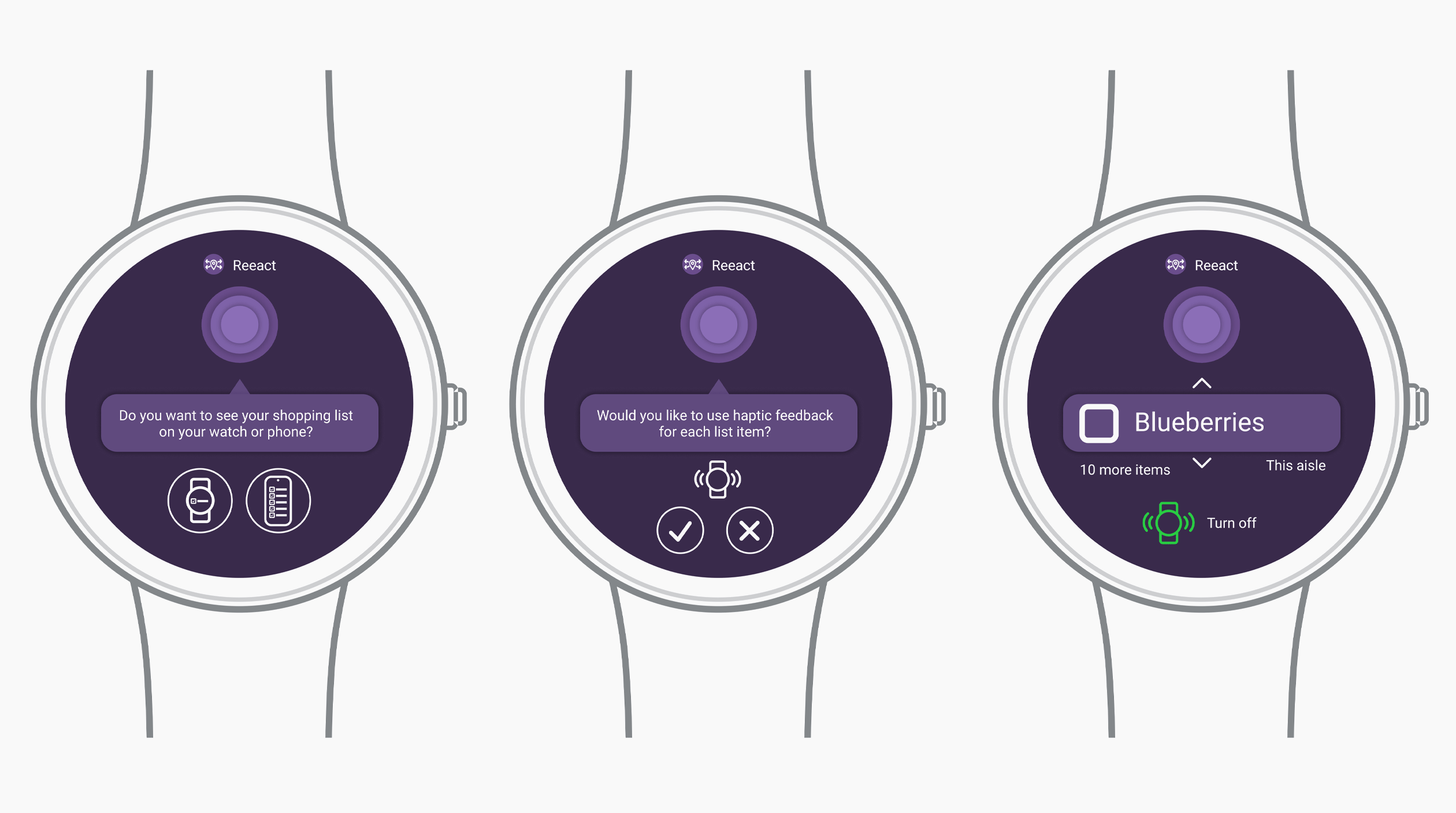
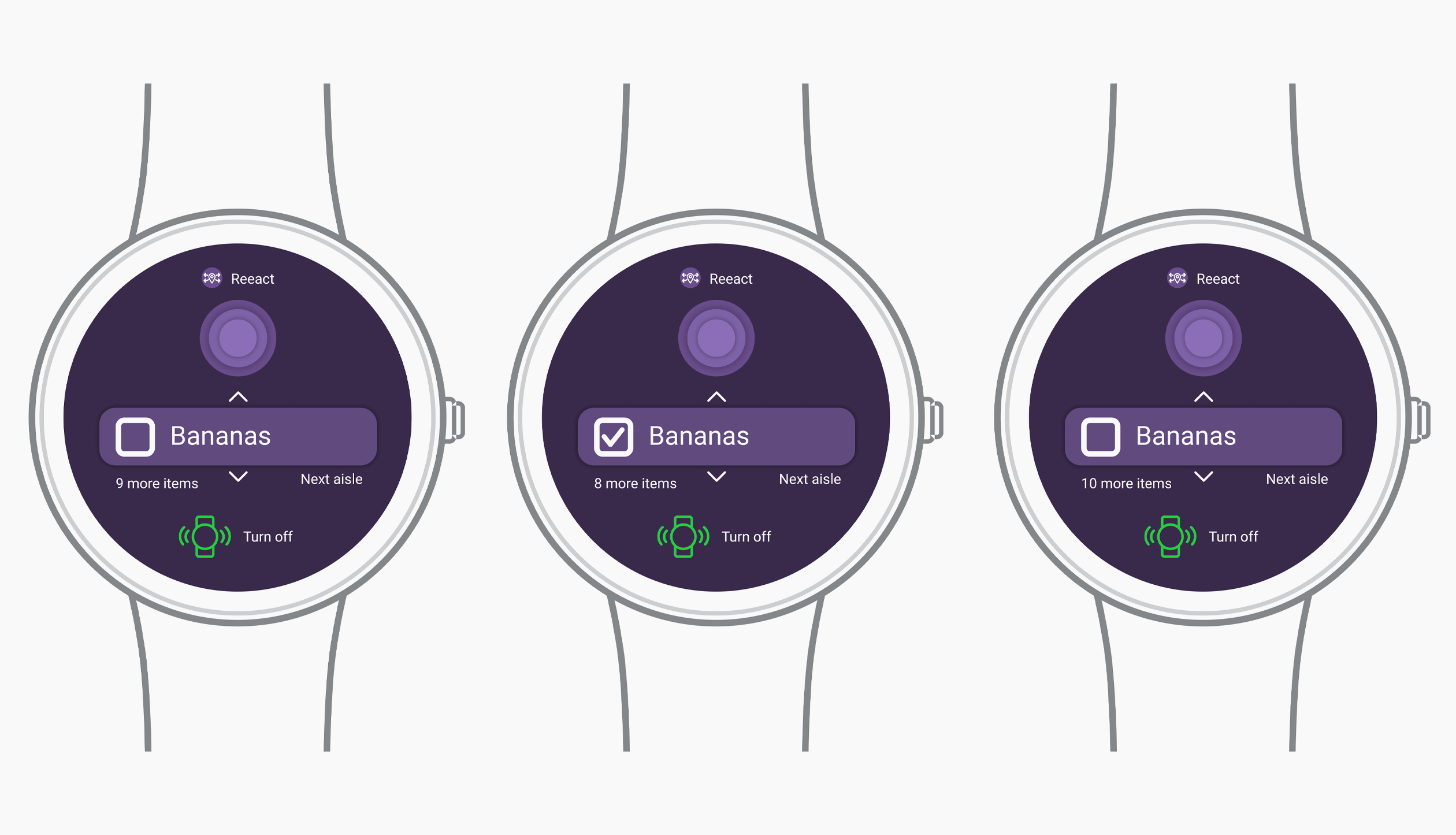
The watch app would be fully aware that the user is wearing a smartwatch with the Reeact app installed. It would send a notification to the users smartwatch asking if the user would like to display their shopping list. There is an option for an item by item list with haptic feedback prompts when the user is in the vicinity of the listed items. Alternatively the user has the option to view the full list on the phone.
Paper Prototypes
01. Initial message on watch/wearable when user is in proximity to supermarket.
02. The app asks where user would like to see shopping list.
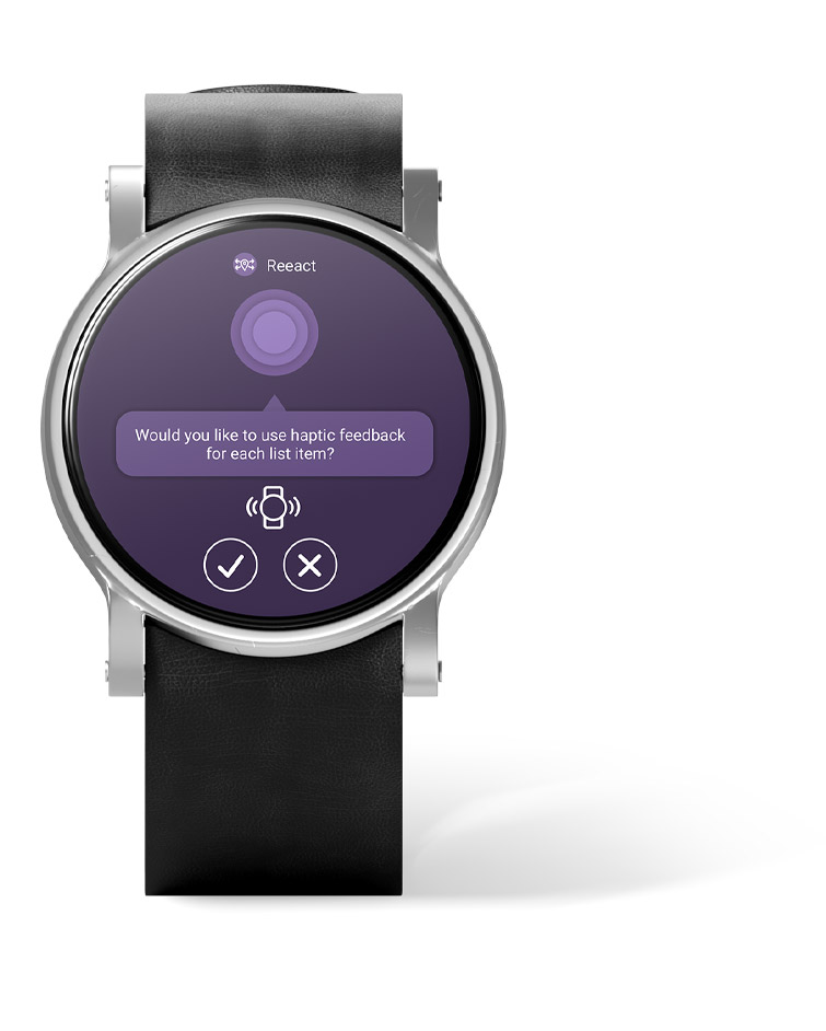
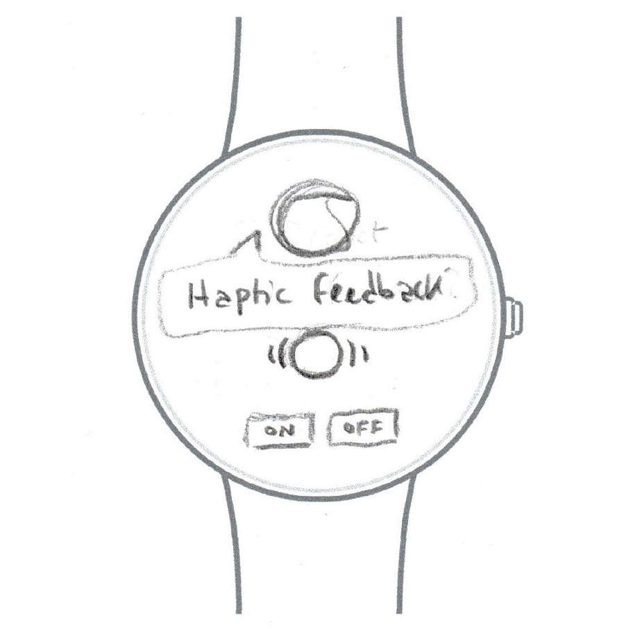
03. In this instance the user chooses the watch to display the shopping list. The app asks if the user would like to use haptic feedback when close to items on the shopping list.
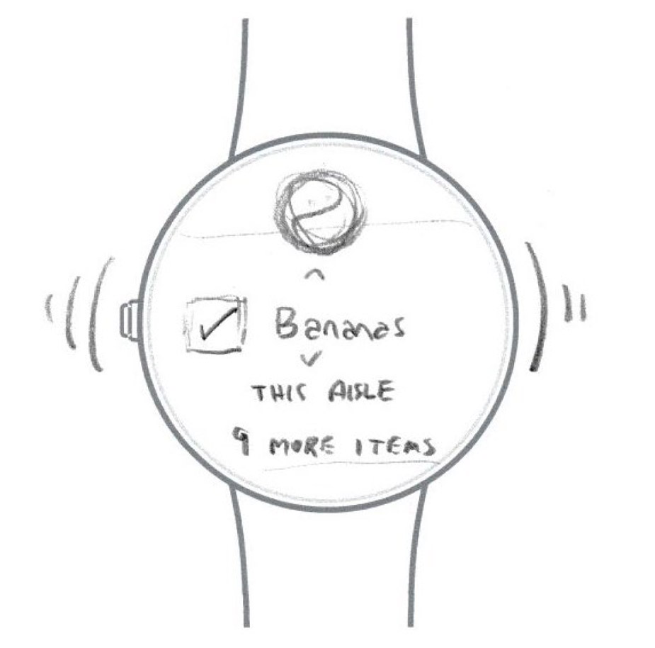
04. The user chooses to use haptic feedback and the watch will display the list one item at a time in relation to the layout of the supermarket and the users proximity to items on the list.
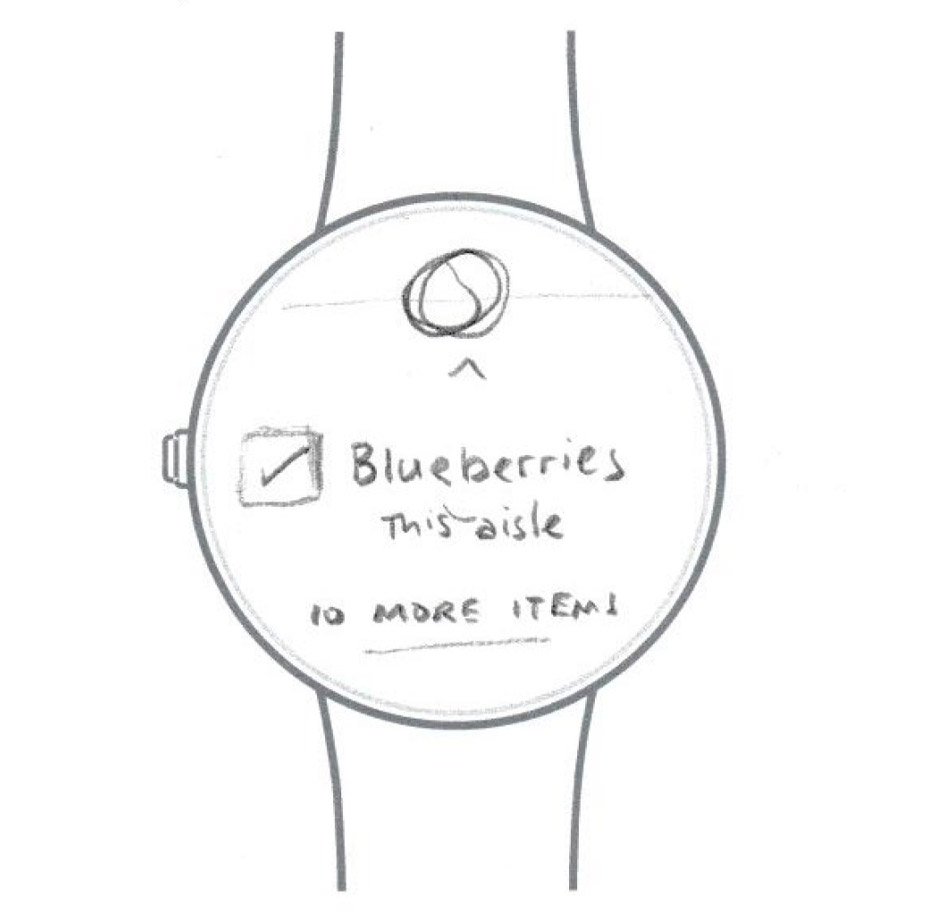
05. The user will manually tick off each item as they collect them.
06. The app will display aisle information and how many items are left on the list.
AI Component
In keeping with the apps general aesthetic I made the AI icon simple. The intention would be to animate the icon with a ‘pulse’ movement when it was communicating with the user.
Figma Prototype
Outcome
The conceptual project was a great learning process and under the guidance of my supervisor I felt I began the development of a genuine product idea that may be possible for full development or integration into existing products in the near future.
I was particularly interested in the challenges I introduced by integrating a wearable and the design of the watch interaction and user experience.
